Author: Malwina Dunder
instagram: @malvinadunder
https://malvinamakeup.portfoliobox.net
ballet: https://malvina.portfoliobox.net
Instagram: @malvinaisdancing
Make up artist & The Color Analysis Specialist: Małgorzata Dunder
facebook: @malgorzatadunderwizaz
instagram: @makeup. dunder
tel. +48 511 525 620
Pictures and graphics: Jacek Ożóg (Facebook: @Jacek Ożóg Fotograf, @studio58jacekozog, @MovieStudio58); Maciej Grochala (Facebook: @Maciej Grochala Photography); Malwina Dunder; Jacek Puwalski (cover design); designed by Prostooleh, Teksomolika, Bedneyimages, Freepik, Kaboompics, Senivpetro, sergeycauselove, stock-world-on, asier_relampagoestudio, mrsiraphol, v. ivash, tirachard, javi_indy, Layerace, Freestockcenter, Solominphoto, Pressfoto, Javi_Indy, Kjpargeter, Pressfot, luis_molinero, Kjpargeter, kstudio, senivpetro / Freepik
Copyright © Malwina Dunder
All rights reserved. No part of this publication may be reproduced, distributed, or transmitted in any form or by any means, including photocopying, recording, or other electronic or mechanical methods, without the prior written permission of the author.
Special thanks to Jacek Ożóg for the wonderful pictures and to the beautiful models: Patrycja, Kasia, Monika, Sandra i Agnieszka.
About
Malvina Dunder
I love the colors!
Makeup and the seasonal color analysis are my passions, also the way to express creativity.
I created various educational materials such as “Ballet makeup” where I share years of experience as a classical dancer (I graduated from ballet school) and “The wedding makeup and fashion” where I wrote down wedding beauty secrets, which I have learned by running my own wedding dresses company.
I also gained experience working for brands like Chanel and Guerlain, as well as Scandinavian web-shops and “Beauty Art” schools of makeup.
I have a beloved white rabbit at home, and I do not support companies testing on animals.
Travel and nature are the greatest inspirations for me. The golden sands of California, the northern lights in Iceland, the lavender field in Provence, the sunset in Bali always find reflection in my work.
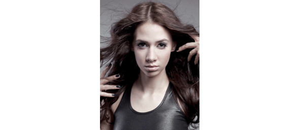
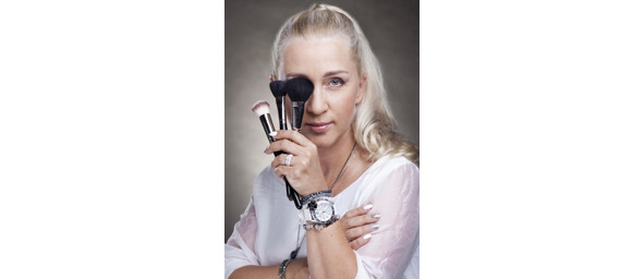
Małgorzata Dunder is a makeup artist, stylist, passionate lecturer at “Beauty Art” Schools of makeup in Poland.
In over 20 years of work, she has trained thousands of makeup artists in Poland and around the world. She worked in Miami, taught in Dubai, trained students in Olivia Keenan School of Aesthetics in Ireland, cooperated with „Trisha Mcdonald Pumper U” — the company organizing beauty events. She has also collaborated with many photographers and people from the beauty industry in Poland and all over the world.
She has worked on many photo shoots, opera performances, fashion shows and various types of events, including charities.
She loves to give lectures in the field of makeup, fashion, color analysis, and many others.
Her mission is to emphasize the female beauty that each of us carries within, as well as sharing knowledge of how to achieve it.
Introduction
There are no beautiful or ugly colors. There are only suitable or unsuitable for the individual type of beauty.
Thanks to the discovery of your color palette, it is possible to emphasize your beauty and feel comfortable in any situation. The right colors make the smile, eyes, and complexion shine with a beautiful glow.
There is a significant deficit of professionals who can perform a professional color analysis, not only in Europe but also in the world. There is much contradictory information on the Internet, which makes it easy to get lost in this issue, especially at the beginning of the path to this beautiful world of colors. What makes it even more challenging is the fact that it is tough to explain to the other person how to perceive colors and shades. It is a very individual matter because colors are sensory impressions such as music.
The analysis presented here is logical and straightforward. It is based on the four seasons of the year, and in my opinion, this system is the best one, as it is compatible with the rules and creations of nature. I learned it from Mrs. Beata Małachowska and my mother, Małgorzata Dunder, who are masters in this profession. Based on the four seasons analysis technique, I advise building a solid foundation for this fascinating knowledge and exceptional skill. This book is written for people who want to offer professional analysis and people who want to learn more about their type of beauty.
The purpose of color analysis
Color analysis is the observation of natural colors occurring in the eyes, skin, and hair of a person and highlighting them with the same color group.
This can be done with the help of equipment (e.g., a set of scarves), a technique that facilitates the analysis and the expert eye.
We divide colors into four groups: Spring, Summer, Autumn, Winter, and subtypes: light, medium, and strong.
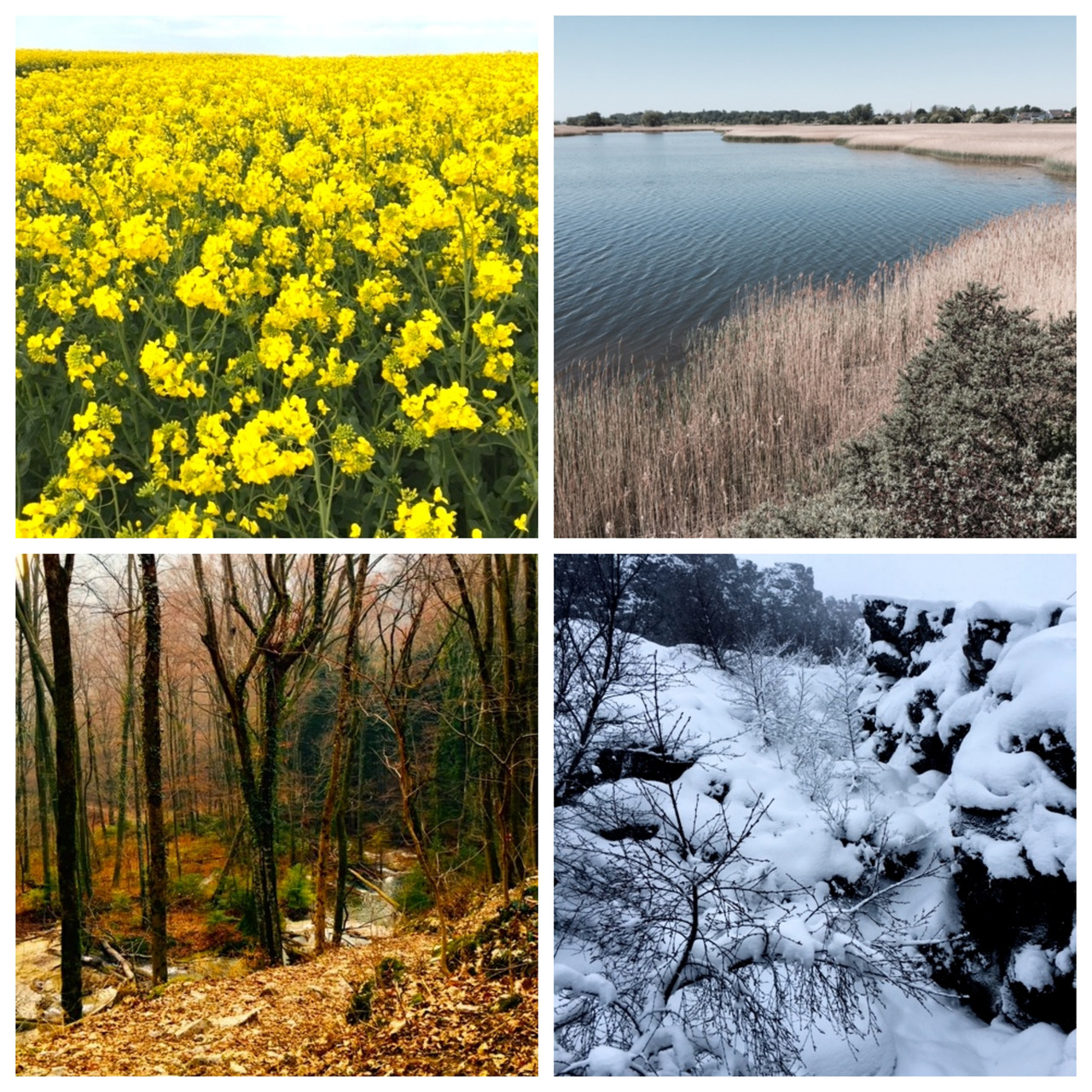
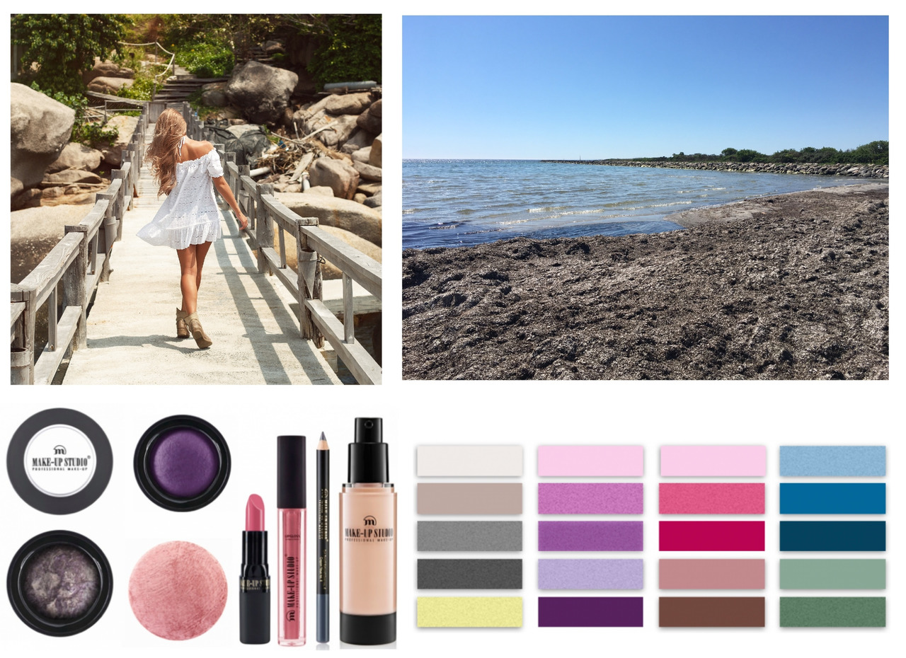
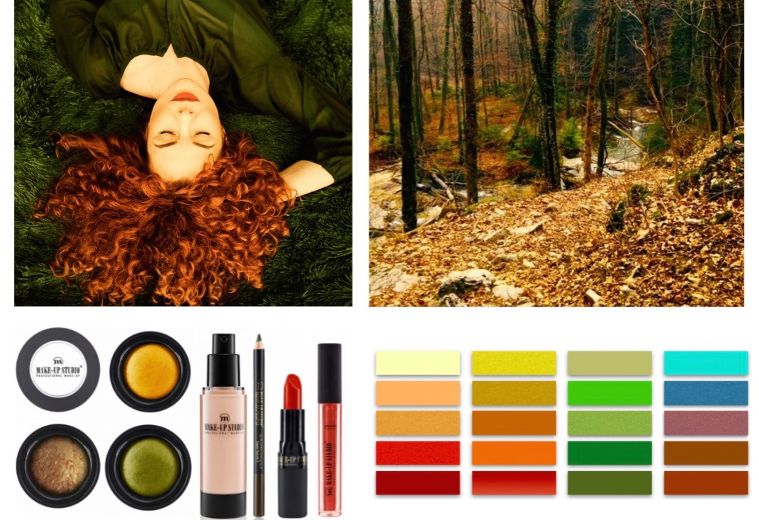
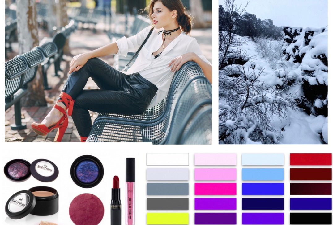
The color analysis is based on what has been created by nature, and in fact, these principles are known by everyone. In spring, everything is born to live, and it turns warm. The grass is fresh and juicy, and we get an energy boost. After a few months of intense sun, the colors become faded, extinguished, and cooled. Morning dew and heather fields beautifully reflect the romantic mood of summer. In autumn, all of the leaves gain gold and warm colors. For centuries, it is considered the time of harvest and abundance, that can be reflected extravagantly. In winter, the weather cools down, and the landscape gets contrast. White and black colors are very elegant. In some places, you can see frozen red holly berries, which are clearly distinguished in the crystalline background.
One of the major advantages of this system is that it leaves a room for your individuality. Everyone is different, and there are not two identical people in the world, and yet there is an ideal order in the division of colors. Style, makeup, wardrobe for individual types of beauty is a concept that can be expanded according to our personality. I think that no one should instruct the other person how to look. However, you can advise those who need it, who feel lost or do not want to worry about it.
The color analysis is a guide to spread your wings.
The color analysis is about bringing out the natural glow, beauty, and vitality of a person. There are colors which do not match our natural type of beauty. Sometimes the shades of clothes may be a mismatch, which creates disharmony, for example, emphasizes redness on the face, dark circles under the eyes, unhealthy paleness. The natural color group highlights the advantages and eliminates the disharmony.
In the color analysis, we divide colors by:
— temperature: warm, cold
— value: light, dark
— chroma: pure (saturated), extinguished (unsaturated)
Millions of women around the world are constantly trying to find their style. They watch tv programs with beautiful actresses, browsing magazines to see what the latest trends are. They follow every “fashion week” and popular blogs and go on a shopping spree. The wardrobe is bursting at the seams, and they still have nothing to wear. Every month we are flooded with the news about what is fashionable this season and what is already “passé.” And still, you get the impression that every season stylish things are the same — Boho style in summer and Scottish checker in autumn.
Cosmetic and fashion industry needs to “drum the fashion up” otherwise it would not see a continuous increase in sales. Therefore, trying to catch up with it, you can lose your individuality.
If we don’t want to get insane in this mass of information, it is worth taking a look at yourself and your natural coloring to determine the type of our beauty, which will help us in:
— emphasizing the advantages
— minimizing any possible imperfections
— saving time, money and stress
— consciously creating our appearance depending on the occasion
— getting a sense of beauty and individuality
— selecting clothes that suit us and which do not
— having fun and getting inspired
— systematize the knowledge of which colors are good for us
It is worth being aware and tell our present and future clients that the color analysis service is a lifetime investment. It is the knowledge that you can always use. With age, the appearance changes, but the type of beauty always remains the same.
I think that every woman feels good to be aware of how to dress up and look impressive. It also gives peace of mind and confidence.
A valuable clue that we have received from Mother Nature is that style comes from the inside.
Keeping up to date with the latest fashion trends can do more bad than good things. Our natural colors should determine our style. The right colors emphasize the advantages and correct imperfections. Thanks to this, we can facilitate everyday life and feel beautiful and unique.
At this point, it is also worth mentioning people who are trying to look like someone else, for instance, like some celebrity. Usually, it ends badly, and this person seems more “dressed up” instead of being dressed. This is because instead of looking deeper into yourself, we look for advantages of someone else and try to copy them.
So it is best to, even for a moment, forget about the current trends of this season! Our individuality and colors will be a solid base, thanks to which we always have something to wear. After proper analysis, shopping will not be a problem, and creating your style will bring a lot of joy and benefits.
In general, color analysis dispels many doubts. If you are wondering why all this is, imagine that you are in an Oscar dress. Do you prefer to hear “you have such a beautiful dress” or “wow, you look beautiful”?
Style, minimalism & “capsule wardrobe”
The color analysis allows us to develop our unique style, and thus, we can create a perfect “capsule wardrobe.” The idea of “the wardrobe in a capsule” was born thanks to minimalists, tired of having a vast amount of clothes which are difficult to compose. The concept is about reducing the number of clothes, and choose the ones that highlight our beauty and figure, so we can mix everything, create different sets and everything will match. I think that we are flooded with impulses from all around to buy new clothes, accessories and generally all goods. It is really easy to get lost in the fashion world, especially without knowing your style. With the help of color analysis, it is much easier to create your style, buy wisely and, as a result, to spend less time and energy before leaving the house.

An example of a well-known minimalist is Bea Johnson, who runs her “zero waste home” blog. She lectures all over the world and promotes conscious and limited consumerism. She has 15 pieces of clothing, and makes 50 sets out of it, buys food products without plastic packaging, lives in a beautiful villa in California, frequently travels with her family and can pack in 10 minutes :-)
On my example, I can say that my wardrobe was enormous and filled with clothes that I liked, but I did not wear them. When something caught my eye, I used to buy it right away, when something inspired me in a fashion magazine or blog — I ran to the store instantly. These things looked beautiful in the closet :-) For many years, buying and possessing things (in the closet) made me very happy. I know this is called “shopaholism”… It all lasted until I began to travel frequently around the world. I realized that I desire to collect beautiful memories instead of striped blouses. I also felt great when I could quickly pack all my stuff in a small backpack and travel to Asia wherein a 40 Celsius degree heat I managed well with a 5 kg baggage. I also witnessed how many suitcases fell into the water from a boat, so I was even more satisfied with my belongings. The best thing is that I’ve never run out of anything! I like sport “casual” style, more feminine style for work and different occasions, in summer the romantic-boho style suits me best. I like different styles and clothes, e.g., extensive military parka, but I do not buy it because it’s not my style, it’s too “crude” for my figure and most of all, it does not express my personality, views or dreams about life on Earth without army and conflicts.
Of course, a massive amount of clothes is not a downside to everyone, and I do not mean that we all should wear minimalistic clothing! No, quite the opposite. My goal is to find the colors in which we look fresh and beautiful, and create a style that is comfortable and timeless, showing our nature from the best side. Being yourself under the strain of all current trends is a real challenge, but also a great joy. It often happens that we like someone very much and we want to look the same. However, in the fitting room (or at home in front of the mirror), we realize that something is wrong. Usually, the answer is simple — clothes do not represent our personality and type of beauty. We feel disguised, instead of being dressed.
I like and appreciate diversity, and the example of a person that I admire is Jenny Mustard, although I know that I would not feel myself in her unique style. She represents a typically Scandinavian and androgenic style. I would feel terrible copying her style, although I like to look at her YouTube channel and see that she is always 100% herself. Thanks to that she has achieved success.
In every season there are many trends and popular styles, such as nautical, feminine, pin-up, folk, ethnic, bohemian, sports, glam rock, goth, sophisticated, vintage, retro, urban and many more. Of course, it is best to trust your personality and dress up in line with it.
As mentioned before: the color analysis is a guide to spread your wings, not fit into a proper box. Everyone is unique, and it is best to emphasize our beauty instead of becoming a clone of someone else. That is why in this book a specific way of dressing is not imposed, but the only beneficial direction, which should be treated as an inspiration, not a strict guideline.
If we like a lot of different styles and it is hard to decide on this one, then it is worth referring to the color analysis, which suggests the most beneficial style for our type of beauty.
The best style for every type of beauty:
The spring — classic
The summer — romantic
The autumn — extravagant
The winter — elegant
The winter blooms wearing a simple white shirt like no other type of beauty. Dark hair, clear eyes, and simple style emphasize her natural traits. Color contrast will not overwhelm her. The spring and summer are more delicate than the autumn and winter so raven black or crystal white near the face will harm their beauty. Autumn is a warm and dark blaze of colors. It is incredible how women of this type of beauty look beautiful in a “mustard” sweater, which definitely cannot be said about the other types of beauty.
When we start to associate a particular style with a type of beauty, we can quickly begin to navigating ourselves better on this topic. The one thing to remember is a quite common misunderstanding that many people associate summer with bright, tropical colors. Let’s think this way: it is the middle of summer, it is hot, and the sun has been shining on the grass and other plants for months. What is happening? Everything becomes faded, and the colors are extinguished. So this is the essence of a summer type of beauty.
In the tropical countries, where the water is azure, and trees are covered with intensely pink or white and lemon monoi flowers, there are usually two seasons. Here we deal with four seasons. Summer is more like the Baltic Sea than the Caribbean, and heather fields rather than the paradise garden.
The color analysis techniques
There are many techniques of color analysis, but the simplest solution is often the best. We can find different methods of selecting the most suitable colors for a person, see more or less popular methods, e.g., 8, 12, 16 types of beauty; 5 elements according to Donna Cognak and accessories such as color frames, foils. They appear every now and again as a “new technique.” I think it is the same as the concept of “strubbing” — this technique has been from time immemorial by the name “highlighting,” but lately it has gained the new name and a second life. The same is happening with the color analysis systems. They are presented differently to cause interest.
I think the division into four types of beauty and three subtypes in each of them is very interesting and we can take a closer look.
12 color types are divided into six categories:
1. Light Spring
2. Warm Spring
3. Clear Spring
4. Clear Winter
5. Cool Winter
6. Deep Winter
7. Deep Autumn
8. Warm Autumn
9. Soft Autumn
10. Soft Summer
11. Cool Summer
12. Light Summer
You can learn a lot from the twelve types of the analysis system. This division can serve well as an inspiration. When we look at the proposed color range, we can see that the palettes are divided in terms of color saturation (lighter-darker). In the system of the four seasons, we define the type of beauty and whether it is strong, medium, or delicate/light.
The color analysis system presented in this book is also divided into subtypes; however, the name and principle are very intuitive: light, medium, and strong. Each of the seasons may have a different degree of saturation. Together, we can distinguish 12 types of beauty.
Below you can see the color frames for each type of beauty (Spring, Summer, Autumn, Winter):
David Zyla developed a fascinating system of color selection and presented in his book „Color your style,” which I consider an exciting addition for anyone professionally performing a color analysis for clients. David designates appropriate colors from the natural palette of body colors, such as the „dramatic” color from the vein shade on the wrist, the „romantic” color from the natural redness of the skin, which is a simple and interesting approach. When analyzing the method described in the book of this author, we observe the natural characteristics of the person and the elements of appearance, but the names are different. Below is the whole division.
THE 5 THAT EXPRESS WHO YOU ARE
Essence: Your vulnerable color, your version of white, a skin tone that harmonizes the colors in the palm of your hand
Romantic: Your passion color, your version of red found by gently pinching a fingertip — or the color of when you blush
Dramatic: Your “look at me” color, your version of blue, found in the color of the veins in your wrist
Energy: The color that supports you when you need a pick me up, taken from the darkest part of your iris (but not the ring around the iris)
Tranquil: Your peaceful color, taken from the lightest part of your iris
3 NEUTRAL BASE COLORS
First base, formal, your version of black, taken from the ring around your iris
Second base, less formal but still serious, your version of brown, taken from the darkest part of your hair [tips in the book for where else to look if you color your hair]
Third base, casual, your version of khaki, taken from the lightest part of your hair (tips in the book for where else to look if you color your hair)
I think that this method works well for people who do not want to delve deeper into the subject of color analysis and do it only for themselves or as an addition for professionals.
You can experiment by mixing a good quality photo (without make-up), for example in Photoshop and determine the exact Pantone shades from individual parts of the body, which will be very accurate and then match the samples with the right colors of emotions.
Please consider that the color analysis can be stressful for a client at first. Her makeup has to be removed, and hair must be covered with an unattractive cap. For these reasons, it is essential to create a comfortable and entertaining atmosphere. I recommend working with the scarves because it looks elegant and evokes pleasant reactions among clients.
Great gift for a client is the color card- small and handy package full of amazingly useful information. It systematizes knowledge and helps during shopping. It always brings much joy, and a client can use it for years. After all, the type of beauty does not change. It is the essence of the kind of beauty that can be easily used.
Our equipment is our investment that can be paid back quickly, depending on the approach. As a practice we can, for example, analyze our scarves, compare them, check differences in shades.
Color analysis is also training, like any other. The more we train, the better effects we achieve. We also gain better self-confidence and satisfaction, which affects customer satisfaction, our publicity, and financial income.
In the age of the Internet, when we do many things online, it is worth discussing the subject of color analysis based on photos and online learning. It has many pros and cons, which I describe below, and everyone can make their own decision.
There are many online color analysis courses, and this can be a good idea if you are learning the theory. However, when it comes to practice, that is where things get tricky. Experience tells me that you cannot learn it professionally without training, because sometimes even experienced specialists have a dilemma. Each person is different, and sometimes it can be challenging to diagnose when we are choosing between, e.g., Spring and Summer, red hair Spring and Autumn, strong Autumn and Winter and strong Summer and Winter. At first glance, differences can be difficult to see, and the responsibility for what we say is vast.
Many people claim that the analysis should not be performed based on a photo sent by email from a client or without a complete process of the analysis, for your own professional sake. Unfortunately, it is possible that you can be an expert for most of your life, but once a person makes a mistake, usually the news about it starts rumors that spread quickly. You can destroy a good reputation with just one word. The downside is that very often, the photos sent by clients are blurred and the beauty changed under the influence of light. The diagnosis cannot be made on this basis.
Secondly, we are responsible for our expertise, and we must remember that we can mislead a person for her/his entire life. I know people with an incorrectly diagnosed type of season, and I am very sorry to look at their magnificent beauty in gloomy colors that take their shine away.
It is quite easy to recognize Winter type or pure Autumn, but if they have dyed hair, makeup, spray tan, and so on, there is a high possibility of a mistake. It may be much harder to get a proper assessment from the picture.
The advantage of online color analysis is that we can perform it in any part of the world at the most convenient time for us. Technology moves the world forward, many people can only use this form of analysis, so in some situations, it is the right solution. It is much easier to assess a well-known person who has a lot of different photos in Google (with makeup and without it, in various colors of dresses, experimenting with different styles of clothing, as well as a child and an adult). Of course, it is much harder to do the analysis based on limited information and low-quality photos, so if you decide to take this route, it is worth establishing precise requirements before starting work.
Online color analysis (course and private service) can be convenient, but also has many challenges, so everyone should decide for themselves, which option to choose.
The division into four seasons
This color analysis system is based on what nature has created. Everyone knows its principles and basics from an early age. Once again, I will come back to the mistaken association of summer with tropical colors. In the tropical countries, where the water is azure, and trees are covered with intensely pink or white and lemon monoi flowers, there are usually two seasons, but here we deal with four. After the sunny months of spring, the colors become faded, extinguished, and this is the essence of this type of beauty. It is more like the Baltic Sea than the Caribbean, and heather fields rather than the paradise garden. Below is a table with the associations.
How would you describe the season?
Spring:
clear
fresh, light, sunny
vivid, life-giving and vibrant
delicate
warm
vibrant, energetic, bright
cheerful, radiant, luminous, juicy
makes a warm impression
colors with a touch of yellow
in the colors of the first spring flowers and fruits
………………….*
Summer:
faded from the sun
soft and ”mossy” shades
gently bleached and diluted
fuzzy and” nondescript.”
burned out by the sun
pastel, powdery, gray
blue, pink and gray
cool and subdued
fuzzy (contrast is delicate)
unsaturated
a smoky color palette
…………………*
Autumn:
colors radiating heat
gold
yellow undertones
copper
unsaturated and deep
earthy
rusty
strong in colors (quite dark)
intense, but always unsaturated
extinguished and muffled
colors associated with safety and Earth
…………………*
Winter:
crystal
clear
iceberg
snow
contrast
acute
cold / cool
colors with a cool tone
saturated
distinct
dominant
…………………*
* A place to add your adjectives that are describing the season and its colors. You can use your imagination and add a place that reminds you of a specific range of colors, for example, a heather field in a small village with Summer or a black, volcanic beach in Iceland covered with snow with the contrasting Winter. Use your associations to remember and recognize colors easily.
TYPES OF BEAUTY
In the same way as above, we can describe the color palette of four seasons and ladies representing these types of beauty, because it is all logically connected. As a reminder, color analysis is the observation of natural colors occurring in the eyes, skin, and hair of a given person and highlighting them with the same group of colors.
SUBTYPES
We can distinguish the subtypes: light, medium, strong in any season.
It is a contractual name that facilitates work. There is no strict line, because for the spring all of the clear and warm colors match, for the summer cold and unsaturated shades, the autumn corresponds to all warm and muted colors, and the winter looks good in all cool and clear colors.
The springs could be very delicate blondes, red hair or light brown hair so they can be light spring, medium or strong. The same applies to the remaining seasons. The summers can be light and delicate, have cool blond hair. It is also possible that they have medium blond or ash brown hair, classifying them as medium or strong subtype. The autumns can have light and warm brown hair, auburn or dark and warm brown hair so they can be light, medium, or strong. The winters can be quite bright with brown hair, green eyes, and gray-brown freckles. They can also look like: Snow White type of beauty, Latin type with a darker complexion, African-American, or Asian.
Everyone is different, and there are no two identical people, the same iris of the eyes, and yet there are an ideal order and logical sense in it.
The more delicate season, the lighter colors can be worn near the face. The stronger season, the darker colors from the palette can be worn, and we can also allow for higher contrast.
For example, Angelina Jolie is a type of summer beauty, which can be seen very clearly thanks to a large number of different photos on the internet. As a girl, she had typical for the summer ash dark blonde hair and “misty” eye color. Then, as a young woman, she often presented herself in the winter colors and looked attractive wearing them because she is quite strong in her type of beauty. With age, however, the pigment is decreasing, and the sharp contrast of winter is overwhelming for the summer, which we can observe in the pictures from recent years.
THE MOST COMMON DIVISION IN THE COLOR ANALYSIS:
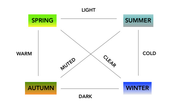
THE SPRING (warm coloring, bright, clear)
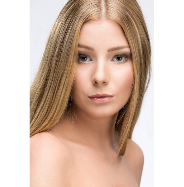
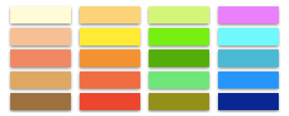
THE SUMMER (cool coloring, light, unsaturated)
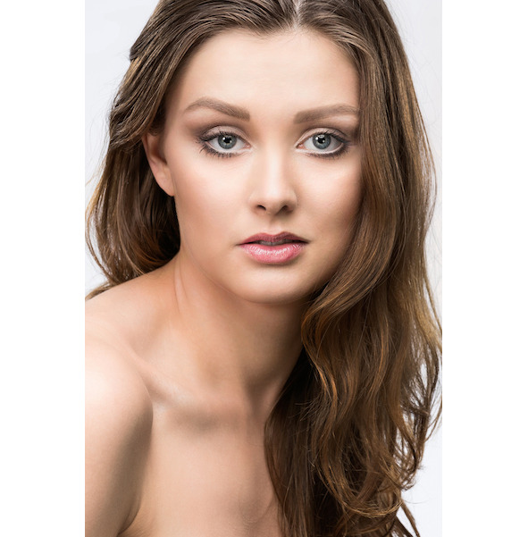
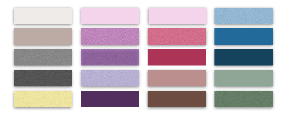
THE AUTUMN (warm coloring, dark, unsaturated)
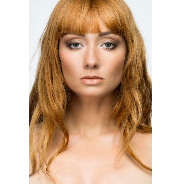
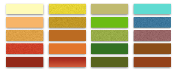
THE WINTER (cool coloring, dark, clear)
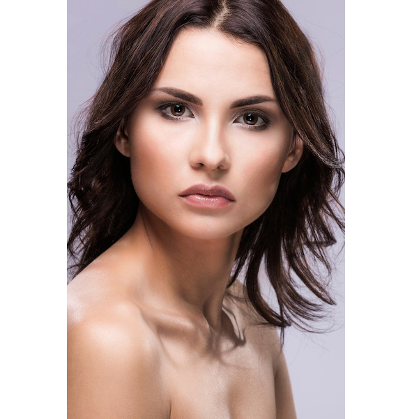
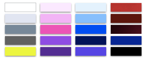
We often see differences only, by comparison, so below you can look again at the pictures of all types of beauty and color palettes:
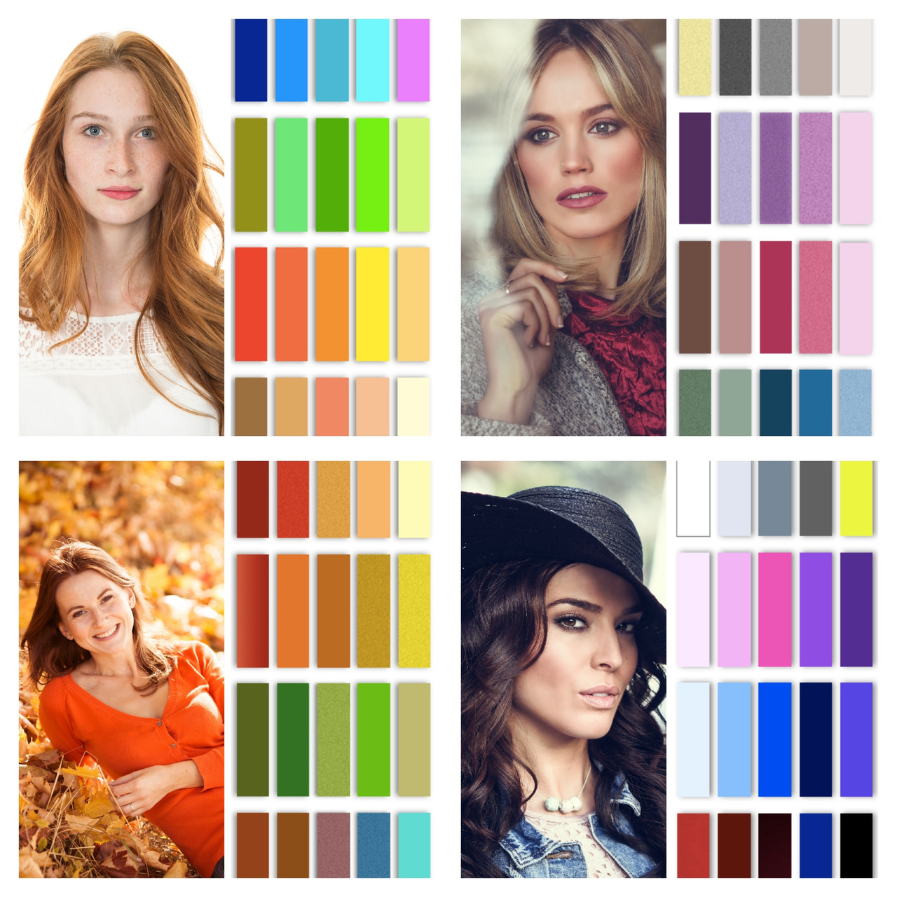
Talking about colors can be very difficult because everyone perceives it differently. Shades are sensory impressions, such as music. This is not math where you can count something accurately, and the result is irrefutable. There is a precise international Pantone color system, but when we are in a specific place, at a particular light, and the like, we cannot study colors correctly, and opinions are different. For many centuries, tones have been studied not only by artists but also scientists. Colors are like music sounds, some people have a special gift, and it is easier for them to comprehend it.
There are some adjectives or names of colors that someone may disagree with, and I accept it completely. Adjectives are sometimes contractual, like, for example, that the spring and summer are light, and the autumn and winter are dark. In the summer palette, there are several very dark shades, e.g., dark: blue, purple, green, graphite, but generally summer and spring are lighter than autumn and winter. In the winter palette, there are shades such as crystal white, light pink and blue, but this season is darker than summer and spring. The most important thing is to look at the seasons holistically and extract the essence of each one of them.
The color analysis is a broad and complex subject, so it is best to give yourself time, read the book several times because every next time there are new things we can discover. Artists, musicians, scientists learn and develop their skill all their lives. The pianist who is endowed with absolute pitch has talent, but it does not mean that he can spend less time on tedious exercises. Likewise, in the color analysis or painting, a person with the gift of perception and distinguishing a higher number of colors has talent, but whether he or she makes use of it, is an individual matter.
When we look at all seasons together, we notice that the spring and summer are lighter than the autumn and winter. We can also call them more delicate, less intense, lower in value, but I think that the word „light” and „dark” is the simplest and understandable for everyone. The word „saturated” and „unsaturated” is reserved for the chroma and refers to pure and muted colors. Pure colors reflect a bright, cheerful, warm, and delicate spring. Darker, contrasting, and cool colors reflect the elegant winter. Dusty or smoky and muted colors are characteristics of summer and autumn; however, the color temperature varies (also summer is not as dark and contrasting as autumn). Cool colors are those with a predominance of blue, while the warm ones are mostly with a yellow undertone.
We can see, by analyzing color palettes of the four seasons, that there is an admixture of yellow in the spring palette, golden in the autumn, grey in the summer, and blue in the winter palette. On the example of red we can see that for the spring and autumn the best is warm color, and for the summer and winter cool shade, however, for the spring the best one is vivid and clear, such as poppies, for the autumn the best is dark and muted like bricks. For the summer, the best is washed out and cold, for example, raspberry red. For the winter, the most beneficial is intense, dark, and cold, such as blood or red wine. In this way, we can analyze all colors and connect them with the seasons.
In the spring palette, there are many peachy, green, blue shades, and all fresh and juicy like the first flowers and fruits. They look light, warm, and vivid. We will not find heavy and smoky shades here.
In the summer palette, we can notice many greys, muted blue, heather or plum, always smoky and cold shades. Here, there is no place for sharp and rusty colors, which are the exact opposite of summer. The natural colors of this season are very grey and pastel, dusty, and “washed out.”
The autumn palette is dominated by rusty, red, mustard, green and brown, in general, earthy and heavy shades. Here we cannot find cool blues, but a full and beautiful range of turquoise. There is no pink, but orange. In contrast to the winter palette, there are also many shades of olive greens and browns. The purple color is warm and desaturated, never pure or blue (with an admixture of blue).
In the winter palette, we can find elegant colors, such as black and white, which are the best for the winter only. This pure contrast overwhelms the other types of beauty, and this is why in different palettes, black is replaced by navy, graphite, or brown. Black is classic and beloved by millions of people around the world, although it does not change the fact that it is beneficial for only one type of beauty.
The four seasons and shades
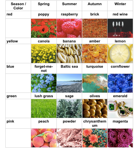
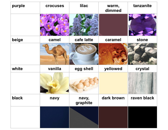
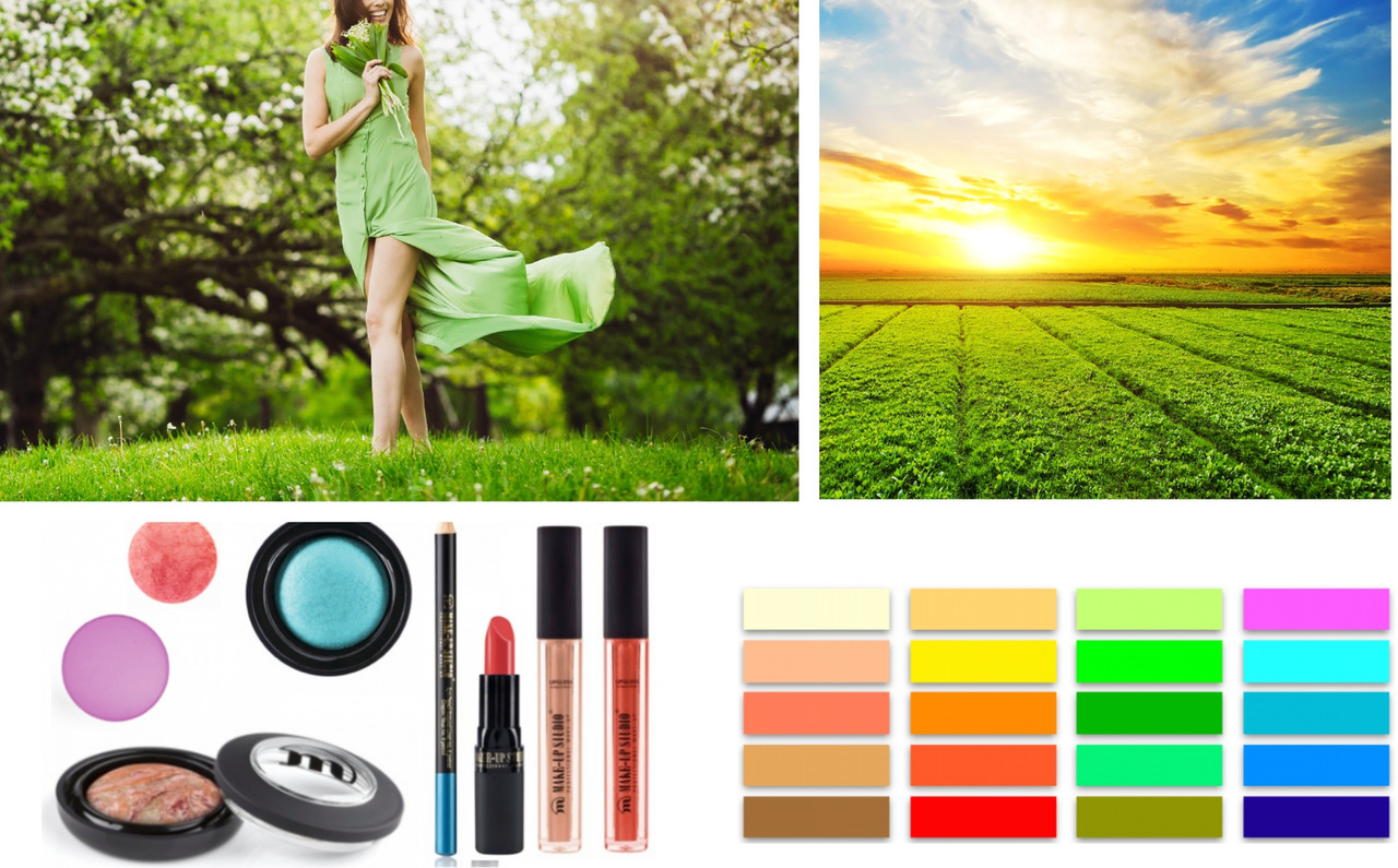
There are many colors and shades, so to make it easy, I created a table with shades and associations. It is a source of inspiration to understand the outline of color division by the seasons generally and to make it easier to remember and recognize shades. There are not all shades here for example, magenta is not the only shade of pink for Winter. When printing and on different monitors, colors look a bit different, this is why I used this mental connection method (it is more reliable in my opinion). Everyone sees colors differently, e.g., some people see turquoise as green and others as blue. Easy way to analyze colors is to connect them with the world we know, ask ourselves is this yellow warm and bright as rape flowers, or whiten like bananas. This method is intuitive, and thus, you can recognize colors yourself without using any probes.
There are no beautiful or ugly colors. There are only suitable or unsuitable for the individual type of beauty.
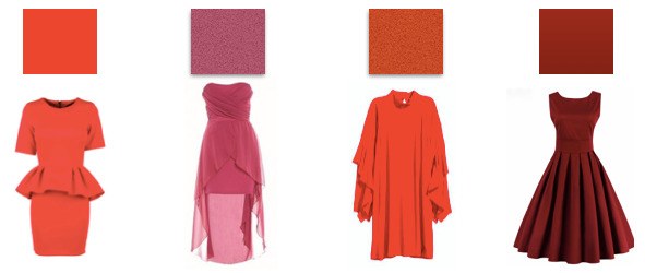
I like to share these words with my clients, so the diagnosis of color analysis is a new and beautiful beginning, not a limitation. Everyone can wear all chromatic colors (i.e., all colors; achromatic colors are: black, white, grey), the most important thing is to find the right shade. This is positive information for us. If we love, for example, red dresses, we can still wear them often. We just have to choose “our” proper shade. For example, for the summer, a cool raspberry red, for the spring poppy red, for the autumn brick, for the winter bloody will be the most appropriate.
Why there are no “mixed” types
Kup książkę, aby przeczytać do końca.
